
Money
wallet app
Our flagship Money Wallet app revolutionizes currency transfers and builds trust beyond traditional banking.
My role: Senior product designer
Deliverable: App audit, Competitor analysis, Interview & Survey, User persona, Visual design.
Project year: 2022
Made with : Figma, Illustration
Overview
I significantly improved homepage user retention, successfully converting new users into repeat users within a critical 3-day timeframe, achieving a 22% retention rate. With the True Money app leading the money wallet app market in the Asia-Pacific region.
In a rapid 7-day turnaround, I revamped the homepage by conducting an app audit on the current design and user journey, identifying pain points through competitor analysis, gaining insights into brand strategies for user engagement in money wallet apps. Subsequently, I conducted interviews and surveys to gather customer insights, utilized the findings to create user personas, and seamlessly integrated visual design.
Collaborated with
-
Product owner
-
Business team
Main problem
-
Overwhelming services: Offers access to more than 70 financial and payment-related services. New users find the home screen overwhelming due to the extensive range of services available.
-
Low Conversion rates : This overwhelming experience can result in new users not completing their initial transaction within the crucial 3-day window, which is essential for converting them into repeat users.
Goals
- Prevent new users from being overwhelmed by seeing so many services
on the home screen. - Display relevant services to new users so that it is easy for them to access common use cases.
- Encourage new users to fund their wallet so that they can perform transactions within TrueMoney Wallet.
Key Insights from the Survey
I conducted a quantitative survey involving 24 participants of the True Money Wallet app by Using Google Forms.
✨ The survey focused on identifying app usage issues and understanding key factors impacting user behavior.
Based on the findings
✨ I developed personas that embody user behaviors and preferences, aiding in crafting user-centered design solutions.

What user's need?
-
User-friendly transaction menu on homepage.
-
Point collection system with cash back rewards.
-
Vouchers available for lifestyle-related purchases.
-
Convenient bill payment options on homepage.
Problem statement
-
Transaction menu is located outside the focus area.
-
Homepage menu functions can be overwhelming.
-
Iconography has too many colors, causing clutter.
Ideation
-
Redesign for clear and user-friendly interface.
-
Prioritize transaction function for easy access.
-
Emphasize point rewards and promotions.
-
Rearrange menu items based on most frequently used functions.
Wireframe

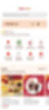
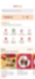
A Comparative Overview

Overview
-
I strategically reorganized the homepage into four distinct sections, each aligned with user priorities. The sections, namely transactions, rewards&promotions, and bill payment and financial features, were structured based on user frequency and preferences. This arrangement optimizes user engagement and ensures easy access to the most relevant functionalities.
-
Use gradient icons to draw attention to important areas as they look modern, refreshing, and visually appealing.

Exploring Feature
01 Transaction
Search bar
-
Adding a search feature would allow users to quickly find specific topics among the many menu services on the homepage.
Transaction area
-
Place money wallet and transaction menu together in a prominent, focused area.
-
Prioritize "Add," "Pay," and "Scan" functions, which are frequently accessed by users.
-
Move and hide "Add friend" and "Transfer" functions, which are seldom used by users, into the money card.

02 Rewards&Promotions
-
Prioritize coins reward and move it out of the "complete mission" menu to encourage user engagement.
-
Display "Mission complete" and "Activity rewards" information directly from the coins feature on the homepage.

-
Prioritize the "True Money Rewards" menu function, which is frequently used by users.
-
Direct users to the "Store" page when they click "See all" menu, which includes favorite services and the online store.
-
I have changed the word from 'All services' to 'Store' because I moved another menu item into the 'All Product Page' in each section on the homepage.
-
I've represented 'Deals' within the 'Shop Rewards Membership.' It appears more captivating than the membership logo, allowing users to recognize the details of the updated promotions and deals.
-
I've divided the 'Deals' and 'Promotion' banners by partner apps to prevent users from being overwhelmed by seeing too many advertisements on the home screen.
-
The 'Shop Reward' page includes membership and deals. I've prioritized membership for users, allowing them to see all the shops before exploring deals and promotions.
03Bill payment
-
Arrange "Top up & bill payment" next to "Rewards and promotion" services as users rarely use it.
04Financial
-
Arrange "Financial" and "Recommend financial services" to the lowest priority as users rarely use them.

Design element
Here is a glimpse into some of the design elements I've crafted. I have invested significant effort in meticulously creating icons from various perspectives to ensure a user-friendly and clean appearance, facilitating easy comprehension.

🥳 Successfully met project deadlines under time constraints, pushing my skills to new heights 😎.
🖌 Proficiently handled various project aspects, including research, problem-solving, idea generation, rapid wireframing, and mockup creation, all within a tight timeline.
✨ Mastered the art of creating refined and effective icons
🤩 Achieved significant personal and professional growth in just 7 days, strengthening a diverse set of skills not typically encountered in day-to-day work settings including effective stress management.".